MatchBox

Overview

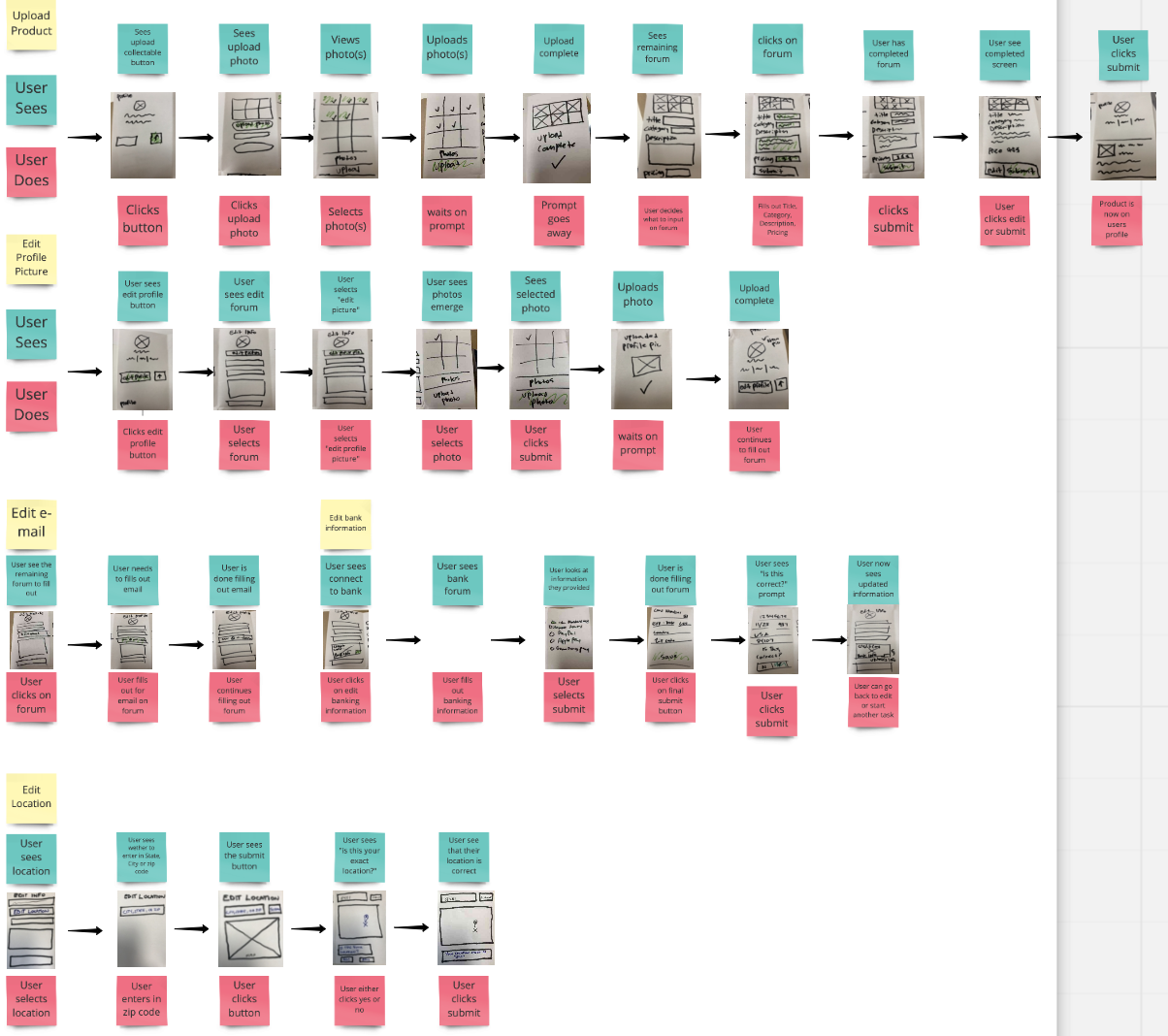
MatchBox is a low fidelity mobile application for collectors. This application is based for users with the intent of building trust with users, authentication, social interaction, rewards, and having a fair market price for buying and selling collectibles.

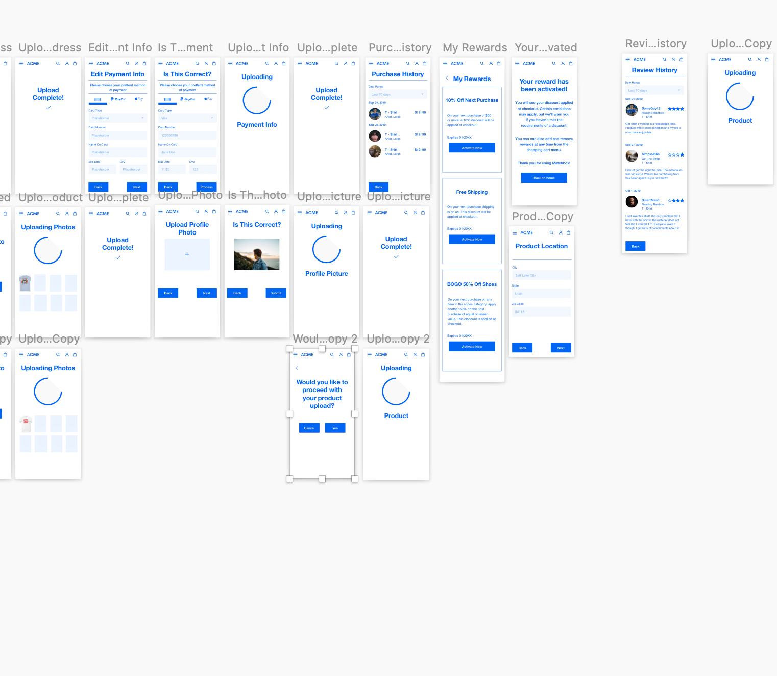
In this case study, I was assigned to design the profile portion of the application. Features that I have implemented are: uploading a product, changing profile pictures, editing email information, payment information, shipping address, purchase history, view rewards, and user reviews.

Role

UX Design Class

Length

October 2019 - Two Weeks

Assumption Mapping

The assumption diagram helped ume to nail down my ideas of what the collector would want in the application.

I have divided my own assumptions into four categories:

  • Purple for desirability.
  • Light blue for viability.
  • Yellow for feasibility.
  • Dark blue for corporate fit.

Based on these assumptions from the collected data, I figured out some important ideas that the user would like such as an easier way to obtain collectibles, having them be authentic, and having a social aspect.

Affinity Mapping

The affinity diagram to help me gather large amounts of data built on our assumptions that has an impact on the relationship of the potential user.

Interviews were conducted and qualitative data was gained through observations, direct quotes, and interpretations.

  • Blue for observation.
  • Purple for direct quotes.
  • Pink for interpretations.
  • Green describe “How can we …. “.

One particular assumption would be that users need something that is trustworthy as they purchase a collectable item. This will give us a better understanding of how to target our audience with the needs that they would like featured on our app.

Empathy Mapping

With the empathy mapping, I wanted to better articulate a deeper insight into the collector's behavior. Being a collector myself, I tried to use some of my own frustrations towards buying and selling online.

My own experiences helped me feel the frustrations and the challenges of empathizing with the collector. Some of the main challenging situations that I found were:

  • Feels - "User wants to feel trust when buying online, but doesn't always".
  • Thinks - "The user would like something at a reasonable price".
  • Does - "Users search multiple places for research and market value".
  • Says - "Says authenticity is the forefront of online shopping".

Personas

The personas that I came up with were two individuals who have previously bought collectibles online.

Serious Sam takes collection seriously and is willing to invest in rare items. He has a disposable income and his income is more than 50k a year. He cares deeply about the item's level of quality and is a verified seller that wants to only buy from other verified sellers.

Casual Cassie is someone that rarely searches for items. When she does, she is looking for a bargain item that has some novelty to it. Her frustrations are price, learning about the process, and lack of understanding value prices. Her biggest issue about buying collectibles is trusted vendors.

Journey Mapping

The journey mapping diagram helped me better understand what the user has to go through to accomplish a goal. I choose what the user's emotions would be when purchasing a t-shirt through eBay.

It was interesting to find out that the user would get very excited to purchase a certain t-shirt. Then that excitement would turn into frustration while trying to find the right one. Once he found the right t-shirt, so nervous jitters would then turn into excitement with a satisfactory accomplishment.

This also gave an insight into opportunities that I could entice the user to keep shopping. Some opportunities would be social/community function to help find the right thing with connecting to sellers, better visuals on seller ratings, and easier filter bar with easy navigation.

User Flows

With being assigned the profile section of this project, I wanted to add features that would help the user comfortably navigate through the application.

Features that I included are:

  • Uploading a product.
  • Changing profile pictures.
  • Editing email information.
  • Uploading a product.
  • Edit payment information.
  • Edit shipping address.
  • Uploading a product.
  • Purchase history.
  • View rewards.
  • User reviews.

Develop and Delivery

Develop and delivery phase consisted of using pre-made wireframes to build out our portion of the application. I used the sketches that I had previously drew out and built out over fifty-plus slides to maximize the capability of using the profile portion.

The prototype portion was interesting. Trying to put all these slides together while trying to make a comfortable user flow was pretty difficult. I had to go back several times and make new slides that I completely forgot. It was an interesting process for my first time doing this and learned a ton very quickly.

Overall Conclusion

What I like about this project was going through the process to discover issues from other users about how their experience was when they bought collectibles online. It was interesting to find out that a lot of my assumptions from the start was either really smart or just plain stupid. I had no idea that so much went into just the profile section of the application. This project was a great first insight on how the UX process can have an impact on how users would use the app and how much they enjoyed it.

It was an awesome first project and I am super proud of how this all came together.