Qkly Marketplace

Overview

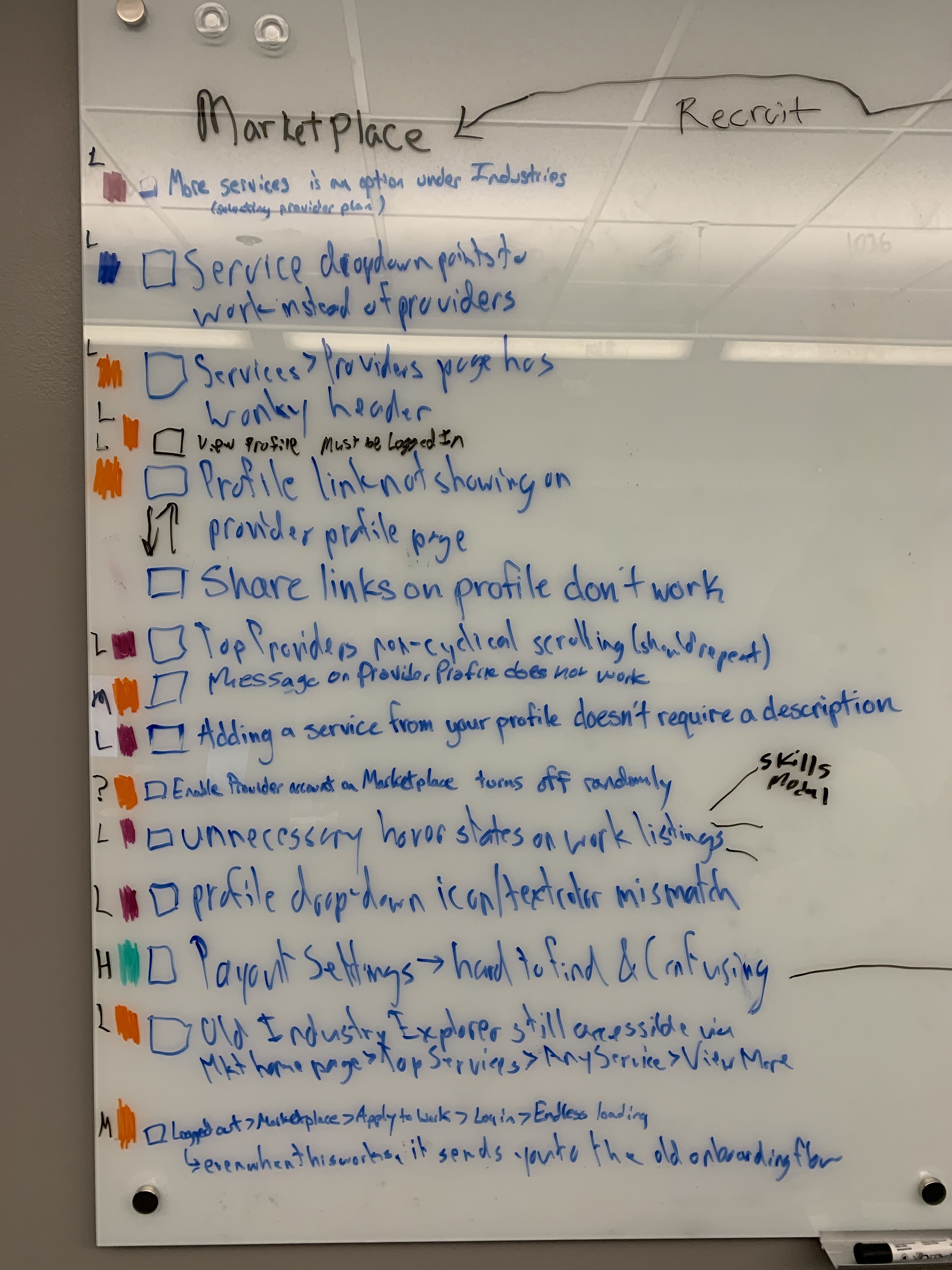
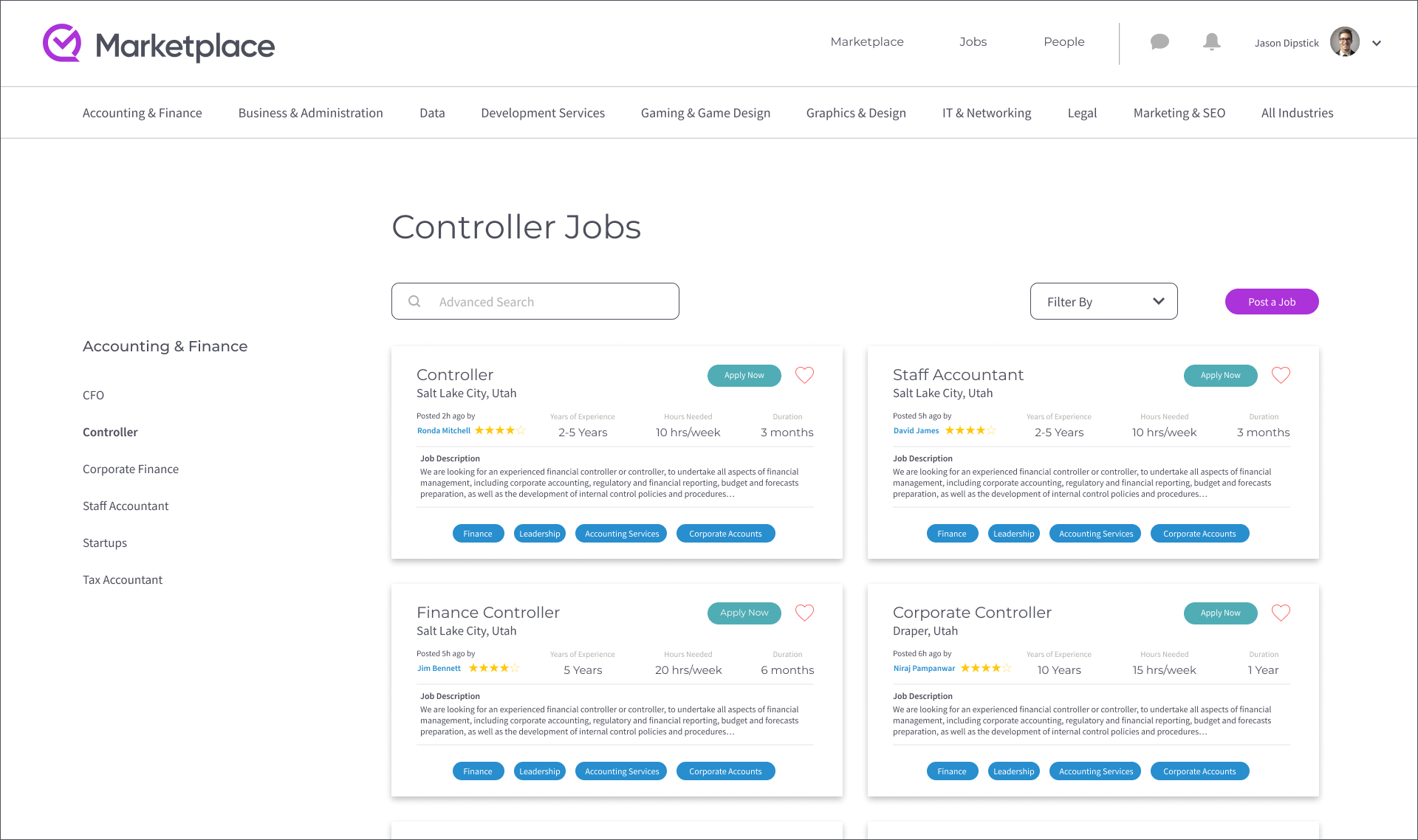
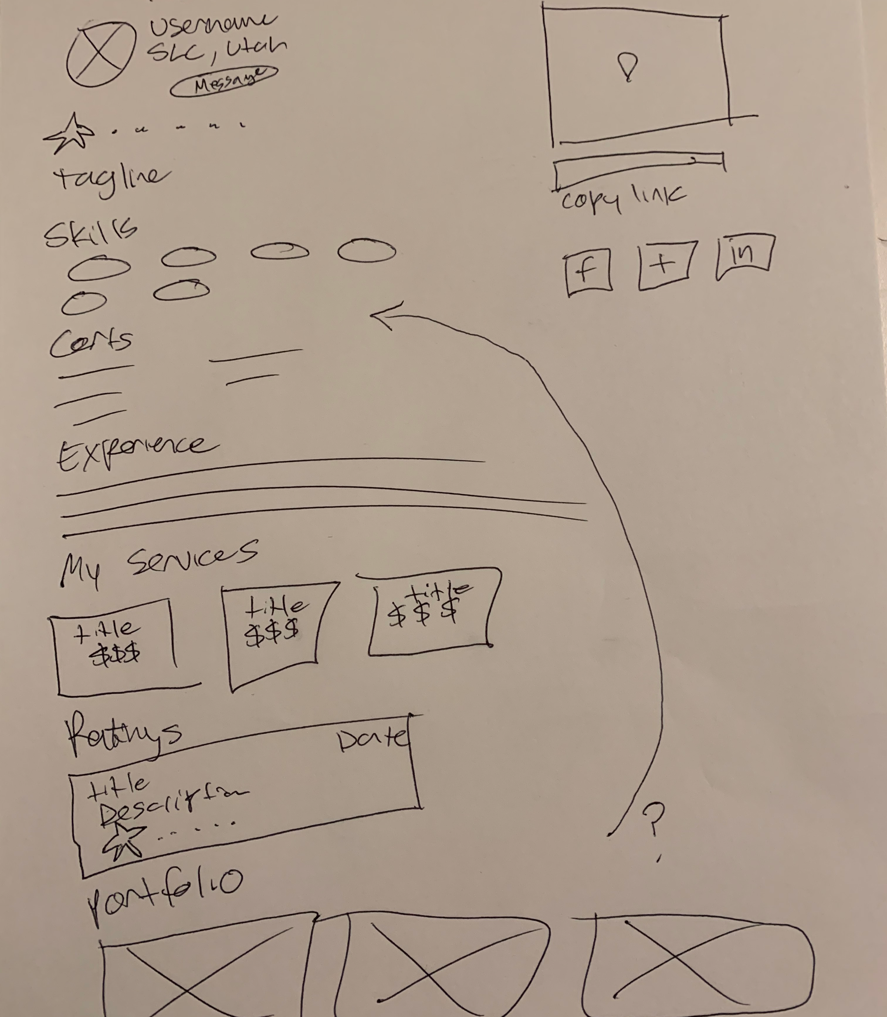
Qkly Marketplace is a network for buyers and providers to find work by offering or buying services.

Think of the Marketplace as a competitor to Fiverr and Upwork.

The Marketplace is unique from our competition is several ways:

  • Providers can assign projects and tasks for tracking progress.
  • Adding time spent on those projects.
  • More transparency on billing with a bigger payout.
  • Showing off your skillset.
  • Variety of services that the buyer could choose from.

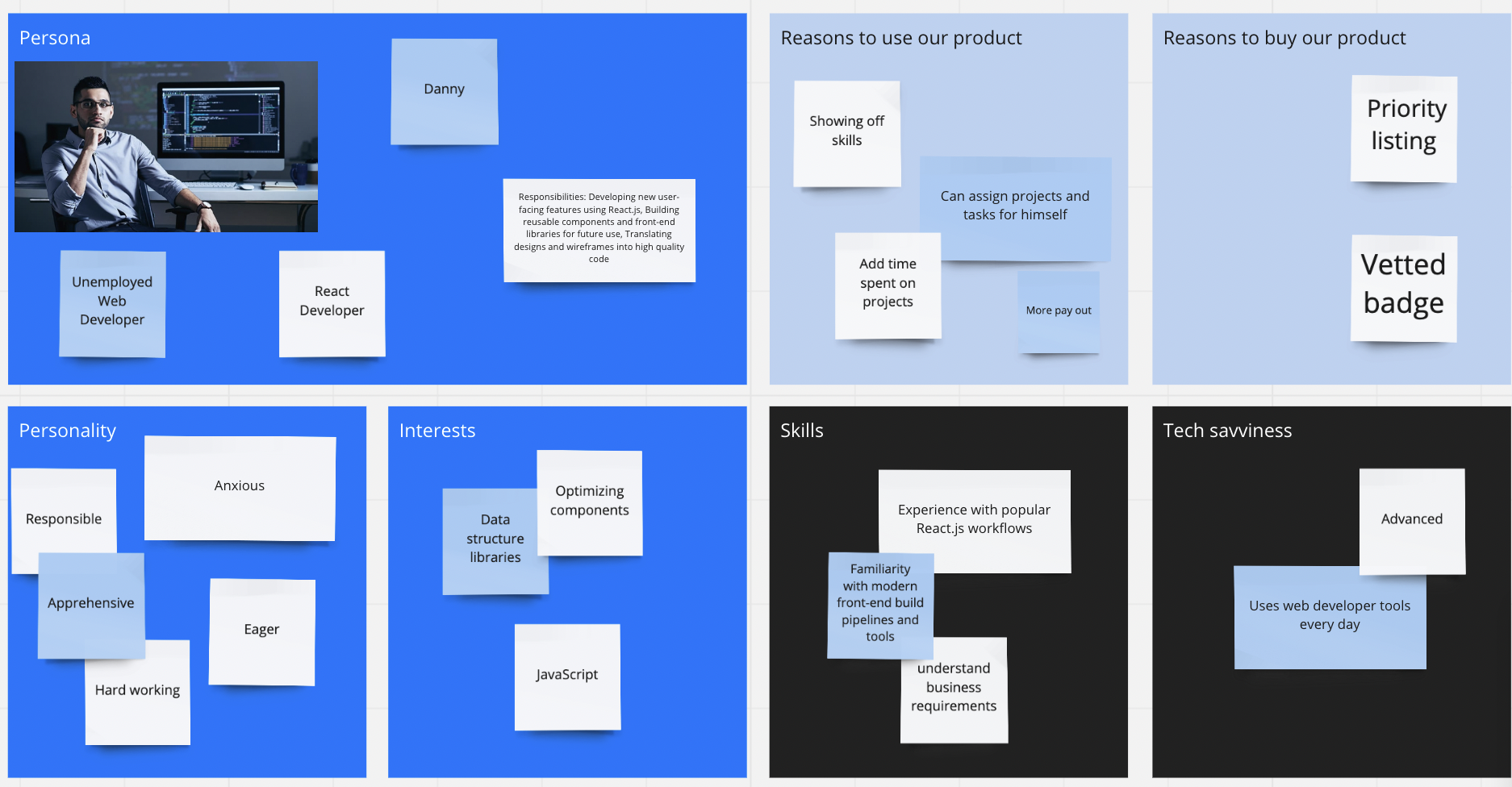
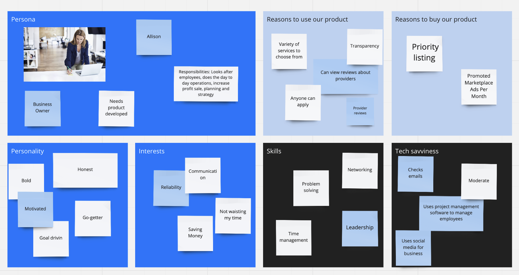
My role in this project was to design each feature and decide the user flow that includes:

  • Sign up process for a new user.
  • Creating your user profile.
  • Posting work.
  • Accepting and declining work.
  • Billing and invoices.
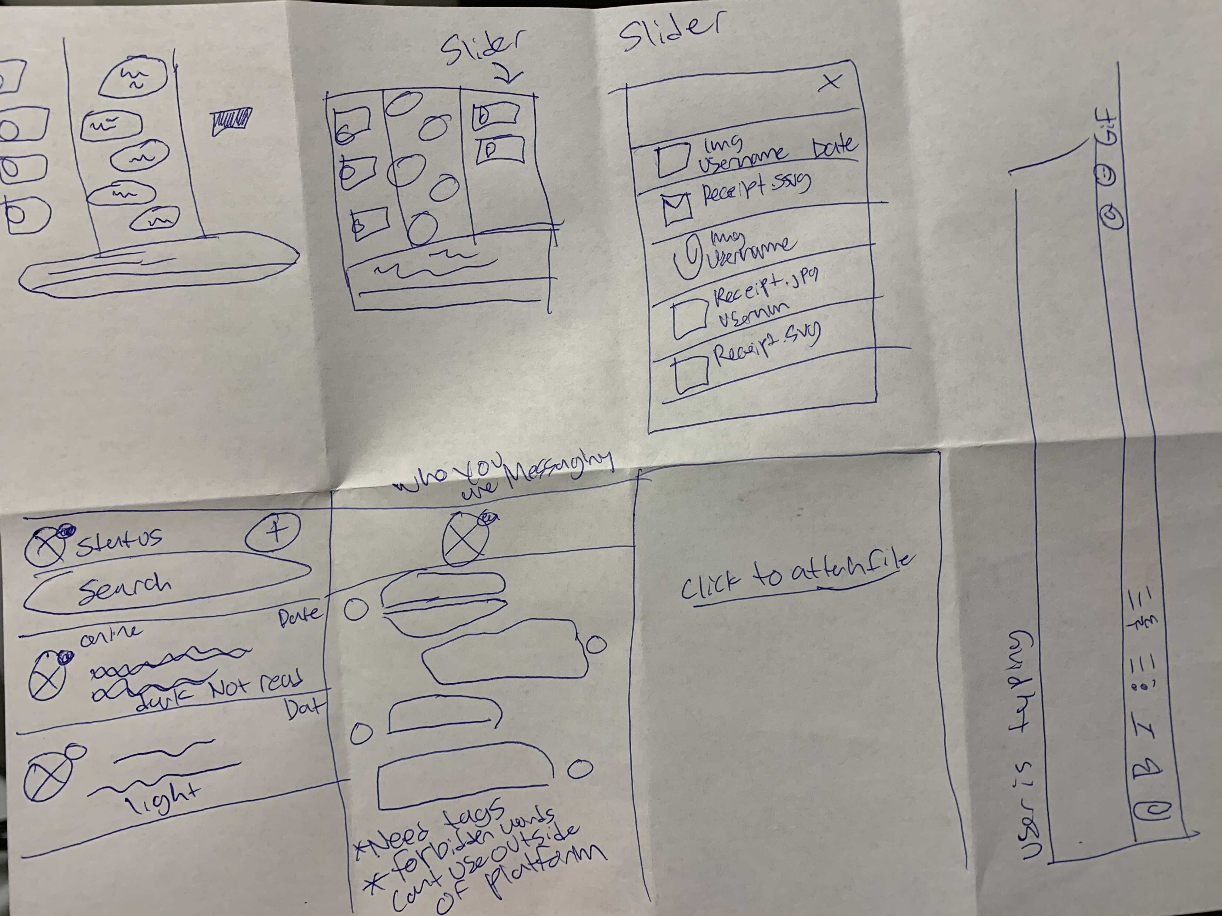
  • Filing a complaint.
  • Messaging.
  • Leaving and viewing a review.
  • Landing pages for the webiste.
Role

Designer

Length

February 2020 - Ongoing

Persona - Provider

I wanted to figure out how a optimistic user would feel while looking for work in a freelance environment.

The main thing that stood out were the reasons to use the product. We wanted to add features to the profile and wondered what users were looking for.

  • Help your profile out by showing off skills that the buyer could narrow down and choose from.
  • Our project management tool helps the user be more organized with tasks.
  • Having fewer restrictions for providers to make more money on assigned work.
  • Author reward for uploading articles or training courses.
  • Checking your progress with time entries.

Persona - Buyer

The buyer persona consisted of a user that wants transparency while going through the hiring process.

I wanted to know how we can make this simple and easy to process while having a large pool and services to choose from.

  • Transparency.
  • Not wasting my time.
  • Variety of services to choose from.

Low Fidelity Mockups

Provider Profile

For the provider, I had a pretty good guess on the features that we would like to showcase. The only thing is which section of the profile would we need to stand out. I decided to make a traditional profile page with the profile picture and username on the right-hand side of the page. Below that the main idea was to show the main features for the buyers such as a messaging button, provider rating, and tagline. Skills were the next most obvious feature to show next. Everything else fell in line that we thought were the most important to have on the profile.


Messaging

While trying to design the messaging feature, I thought about the messaging applications that I enjoy to use. The two the came to mind were Slack and iMessage. I only had a week to design this feature so I had to Frankenstein something together. Features that I included were:

  • The left-hand side of the page is a similar look to iMessage's contacts page. It also has the feature of bold text with a new message that has not been read yet.
  • The middle section has bubble text messages such as iMessage and the typing section of Slack.
  • The right side of the page. Slack has an attachment section that also uses threads. This is one of my favorite features of any messaging feature. It is a great way to easily see your attachments and other messages.

High Fidelity Mockup - Provider Listing

The provider listing is designed for the provider to showcase their profile and for the buyer to easily access the provider that they are looking for.

I wanted a way to show off the provider cards that would show a window into the full profile while showing the most important features.

  • The user name with location.
  • Description of the provider.
  • Buttons that would allow you to access the provider by viewing their profile or to send them a direct message.
  • Top two skill tags with an indication of how many more skills that you have.
  • Buyer reviews for transparency.
  • Average starting wage.

I also thought of how the buyer would navigate through providers. I decided to add the appropriate filters while having the access to the services on the left side of the page.

High Fidelity Mockup - Messaging

The messaging feature for the Marketplace is for the provider to keep in contact with the buyer on assigned work or to message other providers.

The objectives for this feature are to share files, easily message other users throughout the Qkly suite of products, and to keep track of new and old messages.

Revising

The main concern from user feedback on the Marketplace is that the payout settings were confusing to find. This is a huge issue that we needed to solve right away. The reason for that is because our platform is designed for transparency. As a group, we established that we needed to move the payout setting from the user to profile to the dropdown item where it is easily accessible.

Other items that we found:

  • Unnecessary hover states throughout the platform.
  • Loading issues when logged out
  • Non-responsive headers
  • Old pages that are still appearing.

Overall Conclusion

The Marketplace was the first project that I was assigned to when I first started working at Qkly. This was an awesome project because it showed me how to design for a platform that was from the start to finish for hiring or becoming a freelancer.

I am fortunate to see how users are dealing with employment. Freelancing and buying services are going to have a huge impact on our economy for the foreseeable future.