Full Stack 2.0

Overview

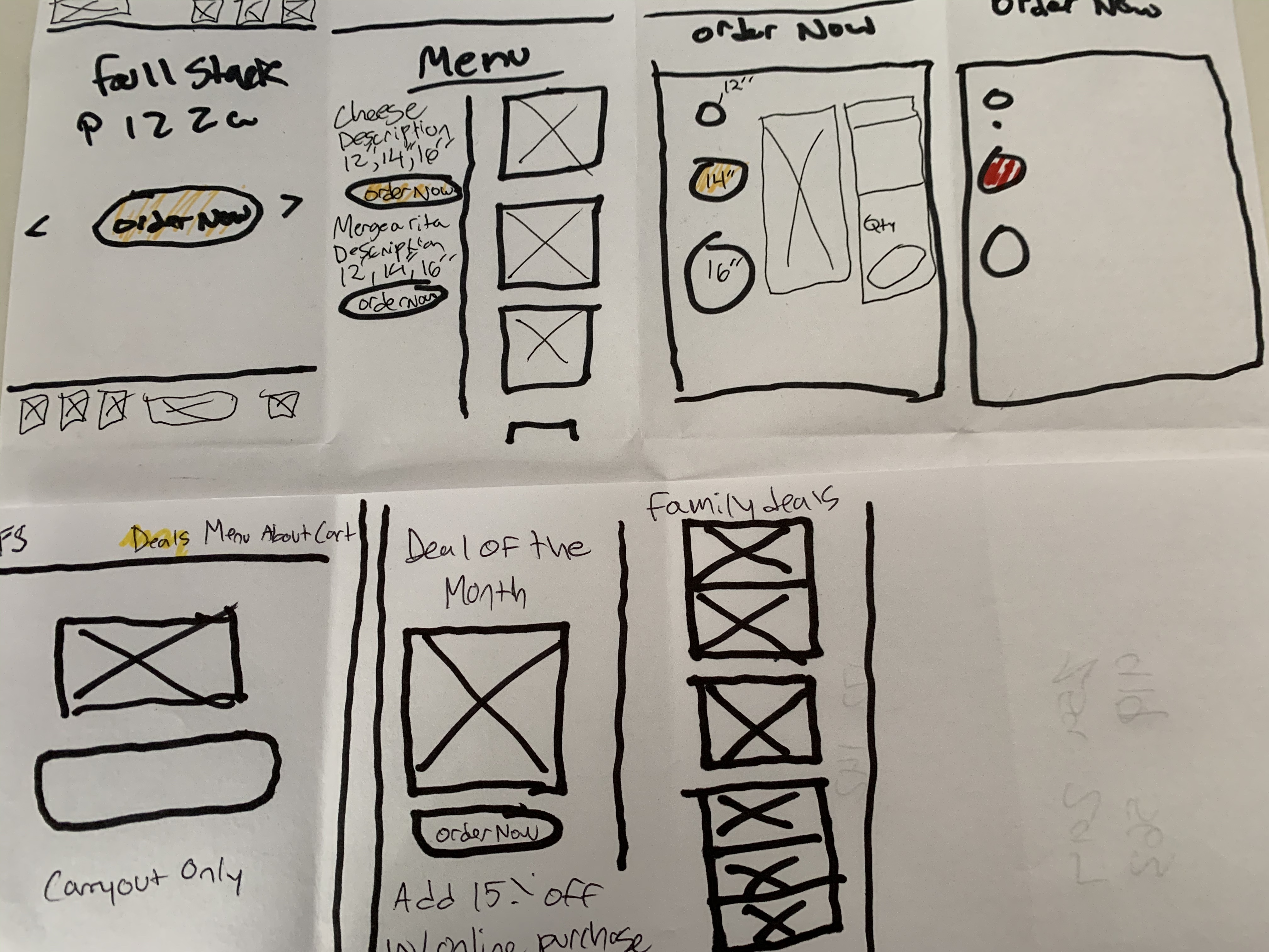
Full Stack Pizza 2.0 is a high fidelity desktop application. This application is based off a previous project that I did in my full stack javascript course at V School.

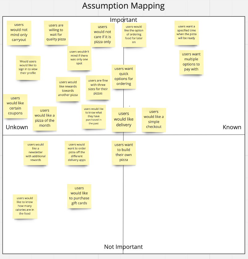
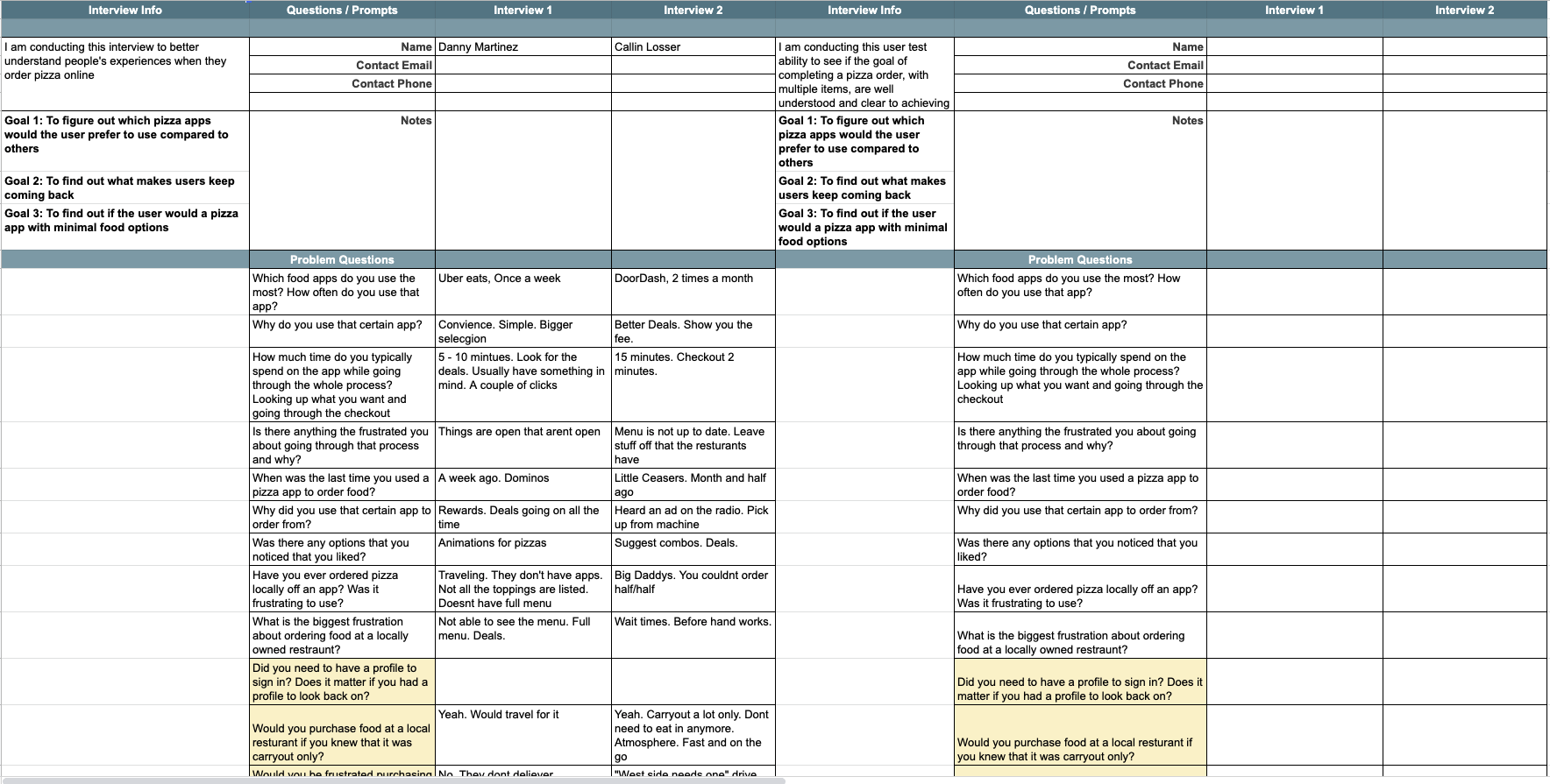
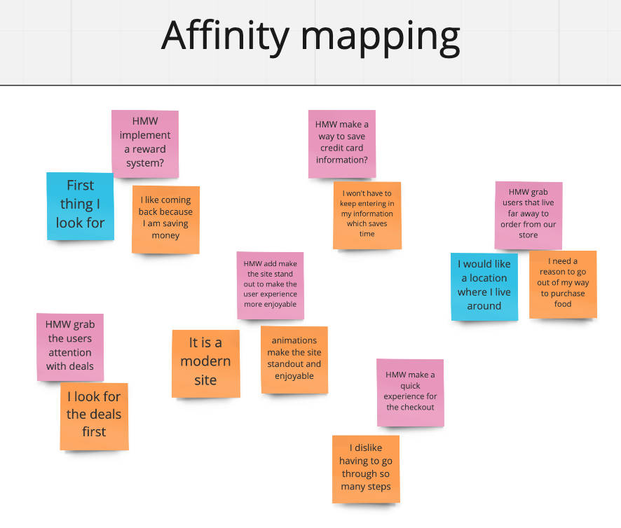
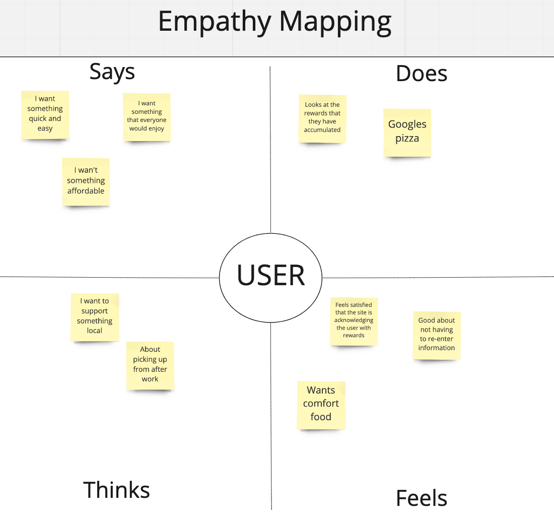
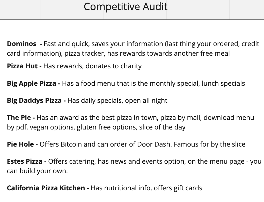
In this case study, I wanted to better understand how local pizza companies websites compete with the bigger chain pizza companies.

I also wanted to completely re-dsign the UI and the user flow from my previous project

Role

UX Design Class

Length

December 2019 - Two Weeks

Assumption Mapping

I started this project based on of how do people order food online. I tried to stay away from just pizza apps. I thought that using every type of method of ordering food online would give me a good foundation to start with.

This assumption diagram turned out to be interesting. Based off my assumptions, I had some idea of what was known and important. It was pretty obvious to me that users would like multiple options to pay and a simple way to pay. The unknowns were a different story. Would users mind that it was carryout only or if there was only one location in the city?

User Interviews and Affinity Mapping

Using the assumptions that I had, I started to conduct user interviews to get a better perspective of how the user would order food online. The previous full stack application only had one location and it was carryout only. Throughout my interviews, I found that people would travel a far distance to get quality food. Another big issue was that I found is that people keep returning if there were deals involved. The previous application did not have this function at all. Doing user research gave ne a bigger inside of what the users frustrations were.

Now that I had conducted my user interviews, I wanted to map out any trends that I saw throughoutt my research process.

  • Blue for direct quotes
  • Pink for "How might we ... "
  • Orange for interruptions and motivation

Empathy Mapping

Now that I had a good understanding of some recurring themes, I wanted to gain a deeper insight of a potential user ordering food online. I determined these insights based on careful observations and analysis as to how they behaved and responded to certain activities, suggestions, conversations, etc.

  • Says - "I want something quick and easy"
  • Thinks - "I want to support something local"
  • Feels - "Feels satisfied that the is acknowledging the users rewards"
  • Does - "Looks at the rewards that they have accumulated"

Competitive Audit

While doing my competitive audit is when things started to come full circle.

I noticed a pattern with local pizza websites that were very alarming. They all had horrible features on them. You can't order online, no deals at all, horrible UI and user flows.

Here are two local sites that I thought were the absolute worst:

After looking at these sites, I wanted to make a local pizza company stand out from the rest. This would create better revenue for the business with also having customers return.

Sketches and Design

My my sketches that I drew out were based around features that the user would like to have that the other local pizza websites did not.

  • Family deals
  • Deal of the month
  • A new menu layout from the previous site
  • A new order now menu that has a completely new UI

Overall Conclusion

This was a really fun project that gave me an insight into actual local pizza websites. I knew they were bad, but not this bad.

Going back and revisiting my full stack project was really rewarding. I never liked how it looked or flowed. I felt disappointed with it. Now to go back and use the whole UX process and really clean it up made me feel accomplished about what I have done.

Link to the original Full Stack Pizza site